Why Typography Can Spark Strong Feelings: 5 Things to Know

What is Typography?
Type is a beautiful group of letters, not a group of beautiful letters.
— Matthew Carter
Every piece of written language, whether it be a sign on the street, a print publication or digital media, says a little more than what’s spelled out in the text. You likely pay the most attention to typography when selecting one for a document meant to make an impression on someone else, like a resume or a party invitation, and then there are too many to choose from! However, on a subconscious level, you’re receiving messages from typography every time you read. In fact, the more effective a typeface is for its purpose, the less you notice it. It’s the awkward font choices that stick out like a sore thumb.
A well-chosen typeface can enhance readability, provide context, suggest a relationship, create a mood, or infuse a bit of personality. In this post, we’ll share a few details to guide you into the deeper end of this intricate art form.
1) Letterform Anatomy
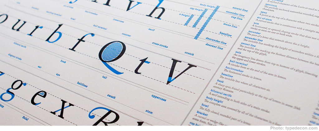
Giving something a name is the quickest way to get to know it. While the dramatic array of typeface names may strike you as superfluous, it may be more helpful to know that there are names for every part of a letterform. When you can see the parts of a letter, you can begin to see the similarities and differences between typefaces more quickly. Here are some of the most common letter details:
- All of the closed spaces in letters are called counters
- The parts of a letter that extend beyond the x height (the vertical height of a lowercase x), are called ascenders and descenders
- A horizontal stroke, as in an uppercase A or H, is a bar
- The axis is the tilt of a letter based on its contrasting strokes
Other names for letterform parts are not commonly agreed upon between typefaces, but it’s easier to determine the character of a typeface when you can identify distinctive pieces of it. Read more about this on the Type Deconstructed blog.
2) Lining & Oldstyle Figures
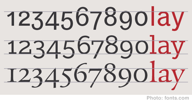
The history of how these two sets of figures came to be is blurry, but it’s good to know they are at your disposal. However, it’s important to note that some typefaces only have either lining or oldstyle figures.
Lining figures are numbers that “line up” with capital letters in a typeface, and they make up the top row of a keyboard. They tend to look best alongside capital letters too; using lining figures in regular body copy can sometimes draw the eye more than intended.
This is where oldstyle figures come to the rescue. Their figures don’t all fit the line height uniformly, but just like lowercase letters, they are positioned to fit pleasingly with the other characters in a line of text. Unlike lining figures, it’s usually in poor taste to use oldstyle figures in an all caps headline.
3) Beyond Serif & Sans-serif
The two main categories for classifying typefaces are serif and sans-serif. These are defined by a typeface having or not having serifs, a small decorative line added as embellishment to the basic form of a character. Typically, categorizing typefaces by serif or sans-serif will guide a design. But, it’s possible to go even further, to help refine a layout and narrow down the tone you want to achieve.
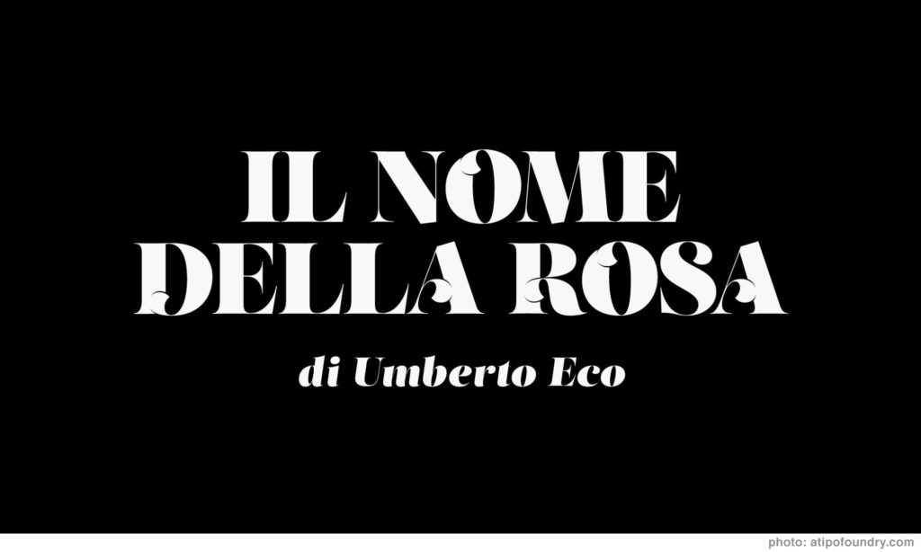
Decorative 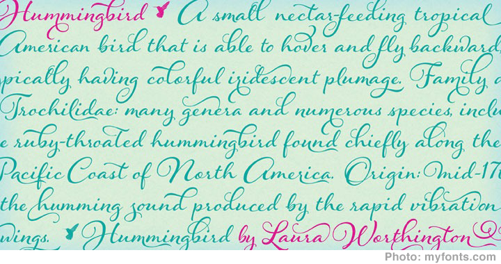
Script 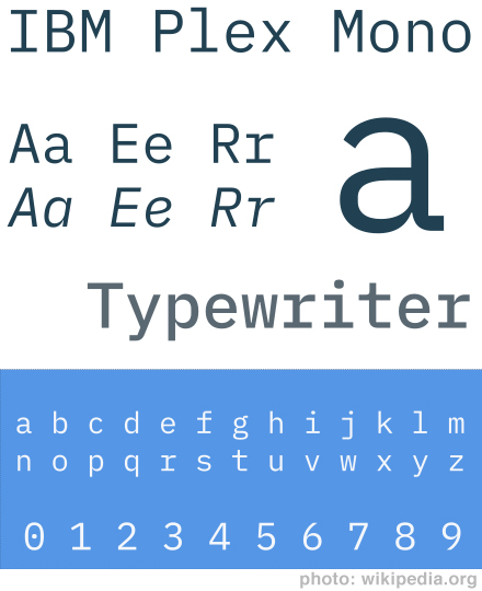
Monowidth 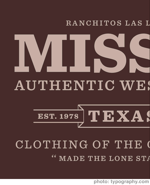
Slab Serif
- Monowidth: Fonts in this category have characters that are all the same width. They originated primarily for typewriters because it’s easier to make all the letterforms fit on the printhead than customizing each one to a different width. These fonts continue to be used in coding today because they produce an equal number of columns. This makes it easier to find a specific point or pattern in the code. And if you’re hoping for a robotic or machine-driven feel à la Bladerunner, these are the fonts for you.
- Slab serif: These fonts have serifs that form a square rather than a round or tapered end. Some good examples are Sentinel, Archer, and Clarendon.
- Script: Meant to mimic handwriting, these fonts can vary wildly in style. Some are a simple set of 26 characters and minor punctuation, and some come with extensive sets of alternate characters that automatically switch depending on which characters they are next to.
- Decorative or Novelty: These are the single-purpose fonts usually in headlines and other main-stage settings. They are fun and beautifully execute their purpose when used sparingly.
4) Contrast
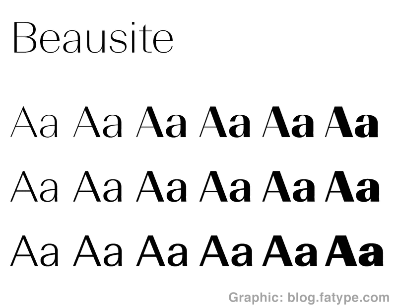
The difference between the thick and thin parts of letters is called contrast. Futura, for example, is pretty low contrast, while Quarto has a high contrast. Noticing this difference in type can help guide decisions about what kind of type to choose for different purposes. Depending on the context, lower contrast type might be perceived as more youthful and loud, while higher contrast type can appear to be distinguished and deliberate.
5) Pairings
At this point in typography history, there are a lot of fonts. We are no longer limited to using one typeface at a time; we can use different typefaces together, called pairing. Pairing typefaces is kind of like tasting fusion cuisine. You may not recognize all of the different flavor profiles, but you know what you like when you try it. With pairing, it’s good to know some common principles so you can know when and how to break them.
Given the facets of type and typography listed above, you can use commonalities between typefaces to suggest relationships. The more characteristics two typefaces have in common (like contrast, height, width or style), the more likely they are to pair nicely together. Think of this in terms of near and distant relationships.The best case scenario is to use a typeface that comes with or has a sibling typeface available. Mundo is an example that has both a serif and sans serif version, designed by the same designers.
This will naturally lead to a pleasing combination because the typefaces have many shared properties between them. And just like sweet and salty is sometimes a great combo, mixing dissimilar fonts can work together quite well. Sometimes a mood or feeling is all that links two typefaces together.
Now that you have a better understanding of how typography works, you can develop your taste by noticing how different fonts strike you and naming what you like and don’t like about them. The more often you think about it, the easier it will be to decide on the perfect font (or pair of fonts) for your next project!
Additional Reading
If you’re ready to learn more about the intricacies of typography, these are some of the best resources:
- Typography in ten minutes | Butterick’s Practical Typography | The author of Typography for Lawyers put together this fantastic resource that has an easy entry point in this section.
- Jessica Hische – Upping Your Type Game | Self-described over-sharer, Jessica also writes long-form in an easy to follow but thorough and helpful manner.
- Elements of Typographic Style | Considered to be the best summation of typographic understanding, this book by Robert Bringhurst paints the most beautiful and comprehensive picture of what typography is. An online edition is also available, teaching the best practices for applying these techniques to the modern web.